Nowadays, every marketer knows how important landing pages are, especially if the main goal of their marketing campaign is to convert more prospects into customers.
The sole purpose of a landing page is to capture your visitors’ information by offering them something useful and valuable in return, such as product sample, discount, free consult or an eBook.
Lucky for you, marketing automation platforms such as smoove now have smart and simple landing page builders – online tools which enable you to create and launch your landing page in just a few minutes.
Still, to create a high-performing landing page and communicate our value in a best possible way, we need to stay focused on the single objective that matches the ad our subscribers clicked on to reach the page. In order to do this the right way, we need to make sure our landing page contains all the key elements for its ultimate success.
When we piece it all together, only then we can design and launch a landing page that will convert time and time again.
So, let’s take a closer look at the landing page core structure and its best practices.
Elements of a successful landing page
Unique Selling Proposition (USP)
The key point of the marketing campaign is the marketer’s ability to define a Unique Selling Proposition (USP). In most simple words, a USP is the answer to these questions: What is it so special about your product/or service and why should people care for it?
A well-designed USP should add value to your offer and show to your customers why your products or services are better than those offered by the competition.
Every USP has key features of its own, and those are:
- An informative and catchy main headline which wraps your offer in a few chosen words
- A secondary headline, smaller in size and placed just under the main one, which provides additional information or clarification of the proposal stated above.
- A reinforcement statement or a closing argument which can be enhanced by repeating of your Call-to-Action.
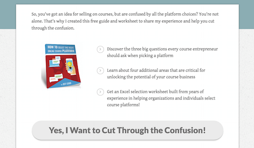
Here is a good example of a strong and simple USP which clearly shows that sometimes we don’t need more than three simple words to get our job done:
Call to Action (CTA)
Call To Action buttons are another essential element of your landing pages. Their main purpose is to make the prospects click on it (take an action) and guide them towards the conversion goal.
It’s important to add that the CTA button is a critical spot of the landing page. In other words, this is what you want for prospects to interact with once they’ve reached your landing page.
So, if you want to convert your leads and bring them to your website, you need to make sure that your CTA button is clearly visible and compelling to click on.
Even with an attractive offer in place, a poorly written CTA can make the prospects leave your landing page before converting. For example, if your CTA button is just “Download” or “Click here” instead of “Here is your free eBook” or “Get your 20% discount”, you can easily lose that precious click-through.
To illustrate on this, here is an example of CTA done the right way:

Lead Capture Form
This goes without saying, but it doesn’t hurt to repeat – every landing page has to have a clear and simple lead capture form. To achieve this, you should pay attention to the following:
- Only require essential information from your prospects such as their name, email address and, depending on your offer, another piece of information related to their location, field of business or something else you find useful for the particular offer.
- A lead capture form needs to be simple in terms of design too. Pay special attention to the selection of colors and make sure it’s placed in a big enough box so that your prospects can see it as soon as they land on your page.
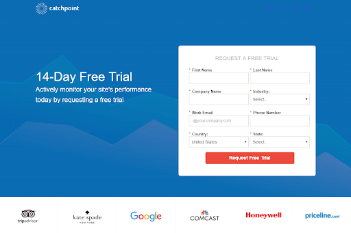
- A landing page lead form also has to be positioned strategically. It’s not a rule, but most forms are placed on the right side, while the rest of the content usually occupies the left side of the page, such as in the example shown below.
Social Proof
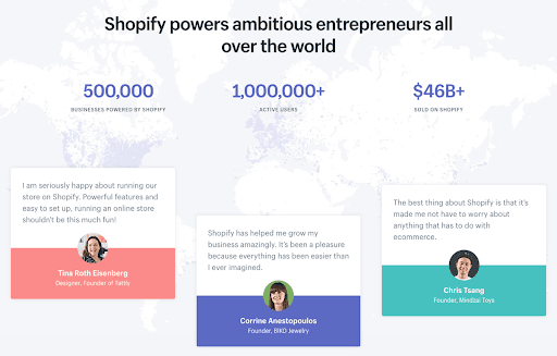
As a very powerful persuasive tool, social proof presents a testimony or a review which illustrates positive customer experiences with your brand, products, and services, such as in this example by Shopify.

It’s important to add that social proof doesn’t always need to be a testimony or a story coming directly from a customer. For example, this can be a simple sentence stating how many new subscribers you attract each month or how many items of a certain product you sold this year.
Also, potential awards from reputable organizations can be a great addition to your landing page.
Wrap Up
With the help of marketing automation, we can now easily design and launch different landing pages for the purposes of our various marketing campaigns. Building our landing pages online helps us personalize our campaigns, maximize the conversions and establish strong relationships with our customers.
Still, to create a truly outstanding landing page, we need to do some core work by ourselves, especially when speaking about its structure and its content. This refers to employing its key elements, and those are:
- Unique Selling Proposition (USP) which displays the value of your offer
- Call To Action (CTA) button which is a crucial spot for conversions
- Lead Capture Form that captures visitor’s information
- Social Proof that illustrates why is your product/service a right choice
Good luck building your next landing page!


